Thursday, 11 February 2010

magazine cover analysis


Although this magazine is only generaliseable to females it gives me an idea on how children are targetted through magazines.
- Bright colours, stereotypically 'female'.
- Main star/ protagonist is the focus.
- Image overlaps the masthead.
- Teasers are also colourfull and appealing to the eye...
- Competitions & quizzes

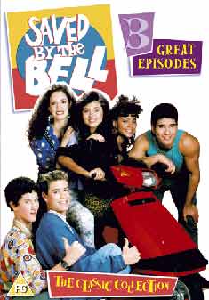
dvd cover analysis


-Style is fairly 'childlike' again hinting at target audience.
-Bright colours that hint at the personality of the protagonist.
-Picture of the protagonist.
- Title in bold font.
-Rating & TV channel.
-Season?

IDEAS- ANCILLARY TASKS

Magazine Cover:

- Characters together, with fades & layering
- 'Skool Dayz' title in graffiti style?
- Include school logo?
- Bright colours- target audience

DVD cover:

- Again, bright and colourfull
- Similar to magazine cover
- Maybe just protagonist?

Wednesday, 10 February 2010

First attempt- photoshop

This is one of my first attempts regarding photoshop editing. I took an image of Jonny Depp from the internet (my images within my coursework will be original) and, similar to the image of Amber i layered it onto a color of choice and added text. Within the piece of text, i added a 'shadow' to make it look more appealing. I will use all of these factors within my ancillary tasks.

However, in order to improve i will need to layer more characters onto my production- therefore providing the target audience with an appealing magazine/dvd cover. Furthermore, the color is too dark, and therefore distracts the audience from the main image. In addition to this, the white box underneath the text looks fairly unprofessional, and in the future i will layer the text straight onto the image.

Good points include, the image in general, i feel that it is a successful image- which looks professional. Furthermore, i like how the image fades into the background, and if this was my ancillary task i would layer the other characters on top- role- wise e.g. main character.


Developed photoshop editing

Within the production of this image, i had to capture an successful image of a character from my children's TV drama. Here, i used a mid-shot so i did not show too much of the character and followed codes and conventions of magazine covers. In addition, i also cropped and cut the image so that i could layer it onto a color background and edit the 'fade' to make the image more pleasing to the eye. However, to make this image even more successful i would need to add text and other pieces of information regarding my children's TV drama.

Saturday, 30 January 2010

changes...

Filming & Main Task

So far within my media coursework production i have encountered a few problems. In addition to this, i have decided to change my target audience. This is because, the actors within my opening are all in their late teens, meaning that it would be harder for a younger audience to connect and relate to the characters on-screen. Furthermore, my target audience is now 13+, making, in my opinion my opening to a childrens television drama more successful. Moreover, i am extremely please with how my recent filming and title making has gone. I have been able to get good, action filled shots of school life- which will hopefully entertain my audience. But, overall i feel most pleased within my developments with Adobe After Effects- making my 'Skool Dayz' title and 'Starring' titles. However, i still feel that improvements could be made within my confidence and overall technical skills, which i will hopefully acheive by the end of my coursework.

Photoshop

Recently, i have been learning how to do various tasks on Photoshop. This will vastly help me within my ancillary task productions of a DVD and magazine cover. In addition, i have learnt how to correctly use layering, colour, depth and text to create an attractive image, which i can use to help within my later productions of ancillary tasks.